Bathroom Accessory Coordination: Creating a Cohesive Look Across All Finishes
Friday 24 July 2026
There's a moment in every bathroom renovation, or hotel bathroom specification, when the individual product decisions have all been made, the tiles are chosen, the vanity is locked in, and then someone looks at the whole picture and realises the towel rail finish doesn't quite match the tapware. The basin mixer is chrome. The robe hook is brushed nickel. The mirror frame leans warm. Nothing is wrong, exactly, but nothing quite sits together either.
It's one of the most common and most avoidable outcomes in bathroom design. And it's entirely fixable if finish coordination is treated as a deliberate decision from the start, rather than an afterthought.
This post is a practical guide to getting that coordination right, whether you're a homeowner working through your first bathroom renovation, a confident DIYer specifying accessories online, or a hotel developer trying to deliver a consistent guest experience across 80 bathrooms. The principles are the same - the scale is different.
Start with your finish: the decision that flows through everything else
Finish coordination in a bathroom is not primarily a style question; it's a sequencing question. The order in which you make decisions matters, and the single most important decision to make first is your primary hardware finish.
Every other accessory, fitting and fixture you choose will either align with that decision or fight against it. Getting it made early, and made deliberately, is what prevents the mismatched towel rail problem.
The four finishes most commonly found in Robertson's tapware and accessories range are:
Chrome. The classic choice: bright, reflective, clean. Works across contemporary and traditional aesthetics, coordinates easily with cool-toned tiles and cabinetry, and is the most forgiving finish in terms of consistency between brands. Chrome in an Elementi tap and chrome on a Zuchetti towel rail will read as the same finish because the reference is a neutral, consistent reflective surface.
Brushed nickel. Softer and warmer than chrome, with a satin rather than mirror finish. A popular choice for contemporary bathrooms where the sharp brightness of chrome feels too clinical. Slightly more variable between manufacturers - "brushed nickel" as a finish description can vary more than chrome, so confirming visual consistency between brands is important before committing.
Matte black. The finish that has dominated design conversations for the past five years, and for good reason: it provides strong visual contrast against white basins and tiles, adds weight and intention to even simple accessory forms, and photographs exceptionally well. The practical consideration with matte black is that it is sensitive to water marks, particularly in hard water areas, and may require more frequent cleaning than chrome to maintain its appearance.
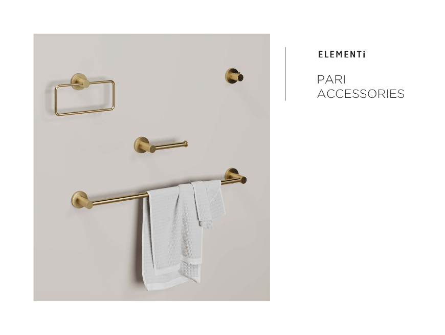
Brushed brass / warm gold. Increasingly prevalent in premium residential and hospitality settings as an alternative to chrome and black. Brings warmth and a sense of considered luxury, and pairs well with natural stone, timber vanities and warm-toned terrazzo. The strongest expression of a design intention - a bathroom with brushed brass hardware reads as a deliberate aesthetic choice rather than a default.
Aaron McMillan, Architectural & Design Consultant at Robertson Bathware, works with clients across residential and commercial projects on exactly these decisions. "The conversation I always try to have early with clients is: pick your primary finish and commit to it," he says. "Not because mixing finishes is wrong - it can work beautifully when it's intentional - but because it has to be intentional. The problems come when a mix happens by accident, because someone ordered the towel ring without checking what finish the tap came in."
You can read more about Aaron and the rest of the Robertson team at robertson.co.nz/our-people.
.png)
Hardware styles and cross-brand compatibility
Finish consistency is one dimension of coordination. Form consistency is another.
A bathroom where every hardware piece - the towel rail, the robe hook, the toilet roll holder, the soap dispenser - shares a similar design language reads as resolved and considered. A bathroom where the towel rail is architectural and angular, the robe hook is soft and rounded, and the toilet roll holder has decorative detailing introduces visual noise that works against the overall effect, even if every piece is individually attractive.
Within Robertson's range, brand families offer a natural route to form consistency: accessories within the Elementi range, for example, share a considered design language that makes coordination within the family straightforward. Samuel Heath accessories carry a distinct character, typically more refined and architectural, that pairs well with premium tapware from the same aesthetic family.
For hotel specifiers in particular, working within a defined brand family across a project's bathrooms has a practical advantage beyond aesthetics: ordering, supply management and compliance documentation are all consolidated through fewer product references.
"For hospitality projects, we almost always recommend thinking in terms of a defined collection rather than individual product picks," says Kirsten Robertson, Architectural Consultant and HR Assistant in Auckland. "When you're specifying 60 or 80 bathrooms, a collection approach means every bathroom has the same coherence, every order is drawing from the same product family, and the project looks intentional at every level - which is exactly what a hotel brand needs to deliver."
Kirsten Robertson is part of Robertson's architectural consultancy team. Read more about the team at robertson.co.nz/our-people.
Cross-brand coordination is possible; many excellent bathrooms combine tapware from one brand with accessories from another, but it requires a deliberate check on both finish consistency and formal compatibility before products are ordered.
The warm-cool rule: the fastest shortcut to finish harmony
If you take one practical rule away from this post, make it this one: group warm finishes together and cool finishes together.
Cool finishes: Chrome, brushed nickel, matte black, polished nickel, stainless.
Warm finishes: Brushed brass, warm gold, bronze, antique brass, rose gold.
Mixing within a temperature group - chrome tapware with a matte black towel rail, for example - is far less risky than crossing the warm-cool boundary. Chrome and matte black both read as cool, neutral and contemporary, and they sit comfortably alongside each other in ways that chrome and brushed brass, or matte black and rose gold, typically do not.
There are exceptions - the deliberate two-finish bathroom, where warm brass tapware is intentionally paired with matte black accessories as a studied contrast, is a legitimate and increasingly popular design choice. But it works because it is very clearly intentional. Two similar-but-not-quite finishes (chrome and brushed nickel, or brushed brass and antique brass) rarely look intentional, and tend to read as a specification error rather than a design decision.
-1784843514-COPY.png)
Mirror frames and the overlooked coordination opportunity
Mirrors are often the largest vertical element in a bathroom, and the mirror frame, or frameless edge detail, is one of the most visible hardware decisions in the space. It’s also one of the most commonly treated as separate from the hardware coordination conversation.
Robertson's mirrors and mirror cabinets range includes framed, semi-frameless and frameless options. For coordinated bathrooms, the framed mirror presents the most direct opportunity - matching or complementing the primary hardware finish.
A chrome-detailed mirror frame in a chrome-hardware bathroom reinforces the finish decision every time someone looks into it. A mirror cabinet with brushed nickel edges in a brushed nickel accessory scheme does the same.
For hotel bathrooms in particular, where the mirror is often both functional and part of the overall impression a guest forms of the room, the mirror and its relationship to the surrounding hardware is worth treating as a primary specification decision rather than a secondary one.
Towel rails, heated rails and shelf alignment
Towel provision is both a functional and aesthetic consideration. In any bathroom, towel rails are among the most physically prominent accessory elements, and any inconsistency in finish or style is immediately visible.
Robertson's range covers towel rails, towel rings, towel racks, heated towel rail ladders and single heated towel rails. Where a bathroom specification includes both heated and unheated towel provision - a guest towel ring alongside a heated ladder, for example - confirming that both are available in the same finish from the same supplier is the simplest way to ensure consistency.
The same logic applies to shelves. A wall-mounted shelf with bracket supports in a matching finish is a small detail that contributes meaningfully to the overall sense of resolution in a bathroom and a shelf in a mismatched finish is an equally visible inconsistency.
Nicola Earle, Robertson's Architectural Consultant for the South Island, notes that the towel rail decision is often where the coordination discipline gets tested on hotel projects. "We find that towel provision gets reviewed late in the process; it feels like a small decision, but it's one of the most visible pieces of hardware in a hotel bathroom," she says. "Getting the heated and unheated rails in the same finish and family is something we always flag early, because retrofitting it is disruptive and costly."
Nicola Earle covers South Island specification projects for Robertson Bathware. Connect with her and the wider team at robertson.co.nz/our-people.
.png)
Soap dispensers, storage and the finishing layer
The final layer of a coordinated bathroom is often the smallest: soap dishes, liquid soap dispensers, tumblers, baskets and robe hooks.
In a residential bathroom, these small accessories are the items that bring personality and warmth to a space. They are also the ones most commonly purchased separately, at different times, from different sources, which is exactly the process most likely to introduce inconsistency.
For hotel bathrooms, wall-mounted soap and amenity dispensers are increasingly preferred over individual bottles, both for sustainability reasons (reduced single-use plastic) and for aesthetic consistency. A wall-mounted dispenser in the same finish as the tapware and towel rail integrates neatly into the coordinated scheme; one sourced from a different supplier in an approximate-but-not-matching finish disrupts it.
The practical recommendation for both hotel specifiers and homeowners is to finalise the full accessory schedule, including small items, at the same time as the tapware and mirror decisions, rather than returning to it later. Robertson's team can provide a full accessory schedule review as part of the product selection support offered to trade and specification customers.
.png)
Lighting coordination
Lighting is outside Robertson's product range, but it sits squarely within the coordination conversation and overlooking it is one of the most common reasons a bathroom with well-coordinated hardware still doesn't quite come together.
The principle is the same as hardware coordination: warm light sources pair with warm hardware finishes (brushed brass, bronze), and cool light sources pair with cool finishes (chrome, brushed nickel, matte black). A brushed brass accessory scheme under a cool, high-colour-rendering white LED luminaire will look flatter and less warm than the same hardware under a warmer colour temperature.
For hotel bathrooms in particular, where lighting is typically specified separately by a lighting designer or the electrical consultant, flagging the hardware finish selection early in the coordination process, before luminaire selection is locked in, avoids the need to revisit either decision later.
Professional designer tips: what the Robertson team recommends
Robertson's architectural consultancy team works with hotel developers, interior designers and homeowners across New Zealand. The following recommendations reflect what the team consistently advises in practice.
Start with a finish board, not a product list. Before selecting individual products, create a simple visual reference, digital or physical, showing the primary finish, the tile palette, the vanity material and the dominant wall colour. Every product selection is then tested against this reference, rather than made in isolation.
Order samples before committing. Finish descriptions are not consistent between manufacturers. "Brushed nickel" can range from almost chrome to almost warm gold depending on the maker. Physical samples, viewed in the space's actual light conditions, are the only reliable way to confirm compatibility before ordering.
Think in zones. In larger bathrooms or hotel suites with separate wet and dry zones, a slight variation in accessory specification between zones can work, for example, a heated towel ladder in the wet zone and a robe hook in the dressing area, provided the finish remains consistent throughout.
Include grab rails and accessible accessories in the scheme. For accessible bathrooms and hotel rooms designed to meet accessible requirements, grab rails and accessible accessories should be specified in the coordinating finish rather than treated as an afterthought in standard stainless. Robertson's accessible range includes options that sit naturally within a coordinated scheme without compromising on the safety and functionality requirements of the specification.
James Robertson, General Manager Distribution, offers a perspective on why this level of coordination detail matters commercially. "The quality of a hotel bathroom is one of the primary ways a guest evaluates the overall standard of a property. When every detail reads as considered - the finish on the soap dispenser matches the tap, the towel rail aligns with the mirror frame - it communicates care and quality without the guest being able to articulate exactly why. When it doesn't, the reverse is true. The details do the work, even when nobody is consciously noticing them."
-1784843620-COPY.png)
Coordinating your bathroom: where to start
Whether you are at the beginning of a new build specification or refining the accessory schedule for a hotel renovation, Robertson's architectural and showroom consultants are available to support the process from finish selection through to final order.
Robertson's Auckland showroom offers in-person product coordination sessions where products can be viewed together in their actual finishes, not on a screen. Robertson's South Island and wider North Island teams are available for project-based specification support remotely or on-site.
Robertson's full range of coordinated bathroom accessories, tapware and vanities is available to browse online:
- Accessories →
- Tapware & Mixers →
- Vanities & Furniture →
- Mirrors & Mirror Cabinets →
- Heated Towel Rails →
Talk to a Robertson consultant about your project →
Quick reference: finish coordination at a glance
| Finish | Temperature | Best paired with | Common caution |
| Chrome | Cool | Brushed nickel, matte black, polished nickel | Avoid mixing with warm finishes |
| Brushed nickel | Cool-neutral | Chrome, matte black | Confirm consistency between brands — varies more than chrome |
| Matte black | Cool | Chrome, brushed nickel | Water marks more visible; confirm cleaning regime for hotel use |
| Brushed brass | Warm | Bronze, warm gold, antique brass | Avoid mixing with cool finishes unless intentional contrast |
| Rose gold | Warm | Brushed brass, warm gold | Strong statement — commit fully or not at all |
Robertson Bathware has been helping New Zealand homeowners, designers and specifiers create beautifully coordinated bathrooms for over 40 years. Our architectural and showroom consultants are available across New Zealand to support your next project. Browse our range or get in touch to arrange a consultation.